I've finally got something to post! I've been busy applying to jobs, training for a 5k, and translating my skills in R to Python so it's taken a little while. Also, I can't get the "Contact Me" form on this website to work, so... I'm workin' on it.
This post is going to focus on the World Bank World Development Indicators database. I've saved all of my work in an iPython Notebook if you want to look at the data and mess around with it, and here it is on nbviewer.
So, you might ask, why Cambodia? I was backpacking throughout SE Asia a year ago, and Cambodia left a lasting impression on me. Not necessarily positive - if you asked, I'd say Vietnam is first on my list to return to. Cambodia left me feeling conflicted about how I was spending my money in a country which appeared so blatantly corrupt and poor. It was hard to understand how so many were begging in the street, how mothers were selling their daughters (best case) to sell bracelets to unsuspecting tourists while rich men drove off in their new Land Rovers after having a lavish brunch. There were large, brand new, empty government buildings that were built next to Khmer Rouge era ruins with the shacks people live in today on top. And then there are the garment workers' protests, fighting for a minimum wage of $160 a month from the current $100. There's been a huge increase of capital flowing around Cambodia, and not much seemed to have flowed to the bottom yet, so I wanted to look at some numbers.
I began by looking solely at the data from Cambodia, but then realized I didn't have any context. So, I've included the World Bank data from the US to compare side by side. Unfortunately, the World Bank doesn't have quite as much data on the US because we have the US Census, and we don't have any World Bank Development projects, so there's less of a need for them to collect the data.
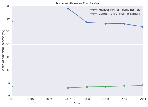
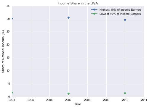
These first graphs show the percent of each country's total income earned by the top and bottom 10% of income earners. When I first looked at Cambodia's plot, I thought, wow, that's pretty stark. The bottom with 4% and the top with 27%? But after I took a look at the US... it actually looks pretty good. 1.38% for the bottom and about 30% for the top in the US is embarassing. There doesn't seem to be much of a trend upward for the bottom either, but it's hard to tell with so few data points. At least Cambodia is trending toward a smaller gap. Context is everything, I suppose.
I found it helpful to look at the data broken down into quartiles. I included both the stacked bar graphs and the scatter plots because I felt both were valuable. The scatter plot helps us look at trends over time since the changes are too small to really detect by the changing sizes in the bar graph. The bar graph helps us look at the bigger picture and how much is going where.
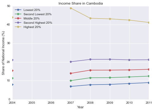
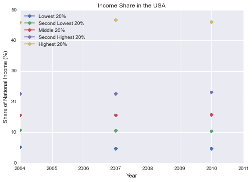
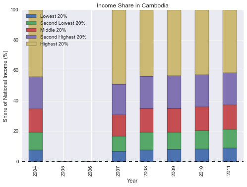
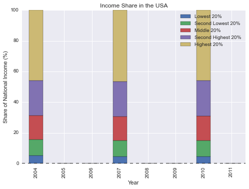
We can see in Cambodia that the gap between the quartiles is closing more and more over time. It appears that the flow of wealth in Cambodia has, in fact, reached the lower income earners. Again, the US looks terrible. The trajectory appears mostly flat despite the recession in 2008, however three data points isn't exactly enough to establish a trend. The disparity here is clearly worse than (at least what the data shows) in Cambodia.
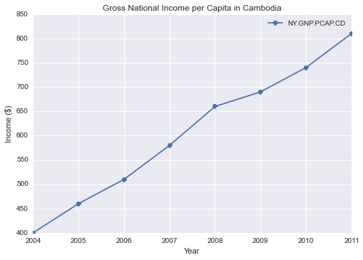
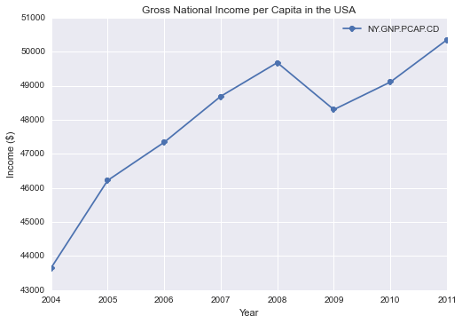
A major difference between the US and Cambodia is how much income we're talking about. Obviously, incomes in Cambodia are much smaller since it is a developing country and the US is one of the richest countries in the world. This is why I wanted to look at the Gross National Income per Capita for each. Note: all of the monetary data is in USD, which isn't totally unreasonable since Cambodians primarily use US currency with Cambodian riel only for amounts less than a dollar.
Cambodia has shown really impressive growth from 2004 to 2011, doubling its GNI per capita. However, it's still very small in comparison to the US, $810 versus $50,350 in the US (which seems pretty high to me, a consequence of the average including our large top 10%). Cambodia's number could also be unbalanced by the top income earners, but our other data would suggest that's not entirely the case. You can see the impact of the 2008 recession in both countries, though less markedly so in Cambodia.
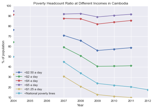
Almost 92% of Cambodia's population lives on less than $5 a day. How can this happen while others spend lavishly at the new Chinese casinos and relax in their luxury cars? Only 10% lives on under $1.25 a day, but that number jumps to 41.26% if we increase the threshold to just $2. It appears that many are living right on that edge. That, and the number living on under $2-$2.50 a day has been increasing since 2009. People who are making the jump above $1.25 a day haven't made it that far.
Obviously the above data doesn't tell the whole story. I can't imagine that these surveys could reach everyone when there's a significant portion of the population that's homeless or migrant. Numbers could be skewed by Cambodian officials looking for more NGO funds, etc. However, if we only have these numbers to judge, they paint a somewhat optimistic picture. It's tenuous, at best.
Further Study
It'd be interesting to look at luxury import statistics. How many cars are purchased in Cambodia? How much do they actually cost, and who is buying them? There's been a huge amount of Chinese investment in Cambodia's resources, which has involved illegal logging. China isn't the only foreign country taking advantage of Cambodia's natural resources, as Singapore has a history of illegally dredging Cambodia's rivers for sand. Given Cambodia's political history and present, I wouldn't fully trust government data. There are several factors at work, and it's hard to put them together to form a bigger picture, but I'll try to provide a glimpse.